West Elm is a $2 billion home furnishings and décor brand under Williams-Sonoma, Inc. that offers a broad assortment of furniture, lighting, and home accessories through its responsive e-commerce platform. This case study highlights the redesign of a high-stakes, mass-customized product detail experience that launched on West Elm and scaled across five additional brands.
THE CHALLENGE
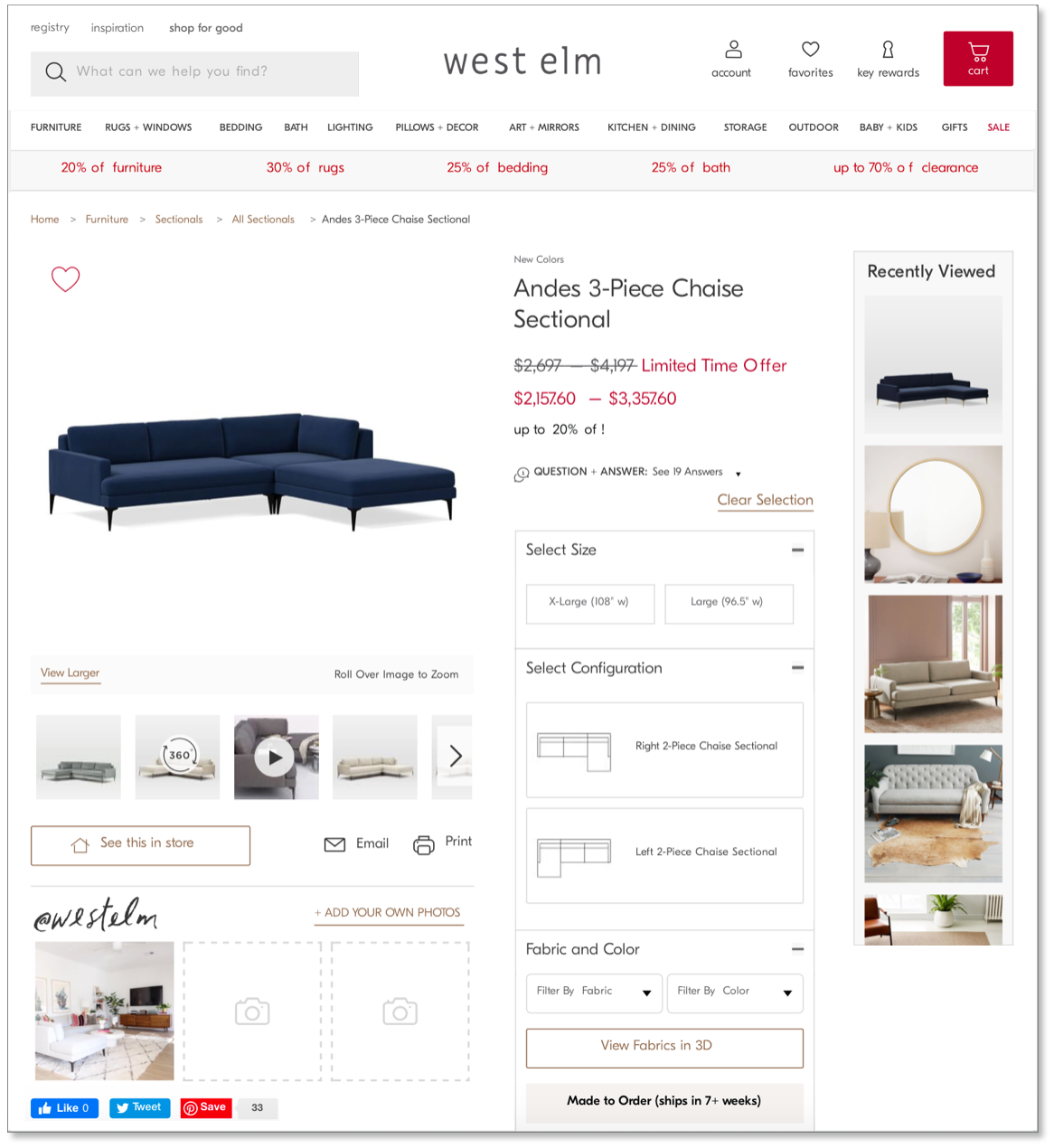
Upholstered furniture is one of West Elm’s highest-revenue categories, but the product detail page (PDP) for this product type had become increasingly complex over time, degrading usability. Customers were required to make up to five interdependent selections (fabric, size, configuration, etc.), with some products offering over 1,600 combinations.
As features accumulated, customers struggled with:
An overwhelming breadth of choices
Content density and visual clutter
Usability challenges navigating the fabric selection
Ahead of a major upholstery marketing campaign, the business committed to improving this experience without overhauling the PDP template, which needed to remain usable across multiple complex product categories beyond upholstery. To hit target dates, we had under eight weeks to hand off designs.

upholstery product page before enhancements
Complicating matters further, the PDP was built on a shared codebase across five other Williams-Sonoma Inc. brands. Any designs needed to be extensible across the sister brands, and require cross-brand alignment before development could begin. A previous attempt to redesign this page had failed to move forward after over a year of design iteration and attempts at alignment between stakeholders.
MY ROLE
As Principal UX Designer, I led this initiative end-to-end—from experience strategy and interaction design through implementation and launch. My responsibility was to simplify a revenue-critical experience without destabilizing it, while creating a design to scale across brands. I partnered closely with Product and engineering leads; consulted with Data Analytics, Merchandising stakeholders; and ensured alignment with business and design leads across the sister brands.

OVERVIEW OF DESIGN DECISIONS
Assessing the quantitative and qualitative data and insights, we identified the highest leverage opportunities—those that could reduce complexity for customers while remaining scalable across brands.
Progressive attribute selection to guide the customer through options step by step
Visual hierarchy for easier scanning
Systemized fabric discovery and guidance to help customers understand the selection
1. PROGRESSIVE ATTRIBUTE SELECTION
PAIN POINT
Customers felt overwhelmed by the range of attributes that appeared all at once.

SOLUTION: PROGRESSIVE ATTRIBUTE SELECTION
We introduced guided, progressive selection, revealing options step-by-step as customers made decisions. This reduced cognitive load and helped customers focus on one choice at a time.
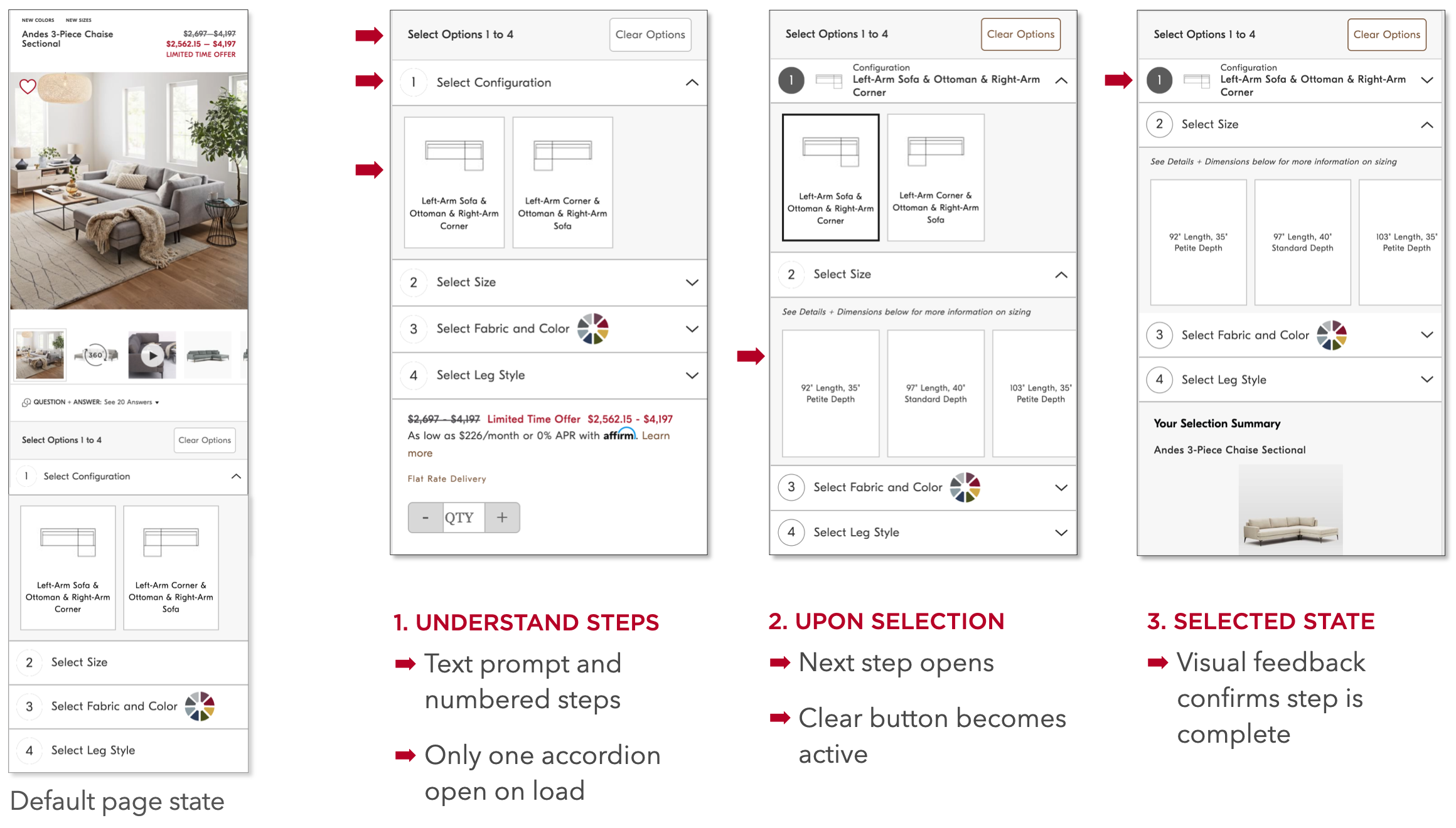
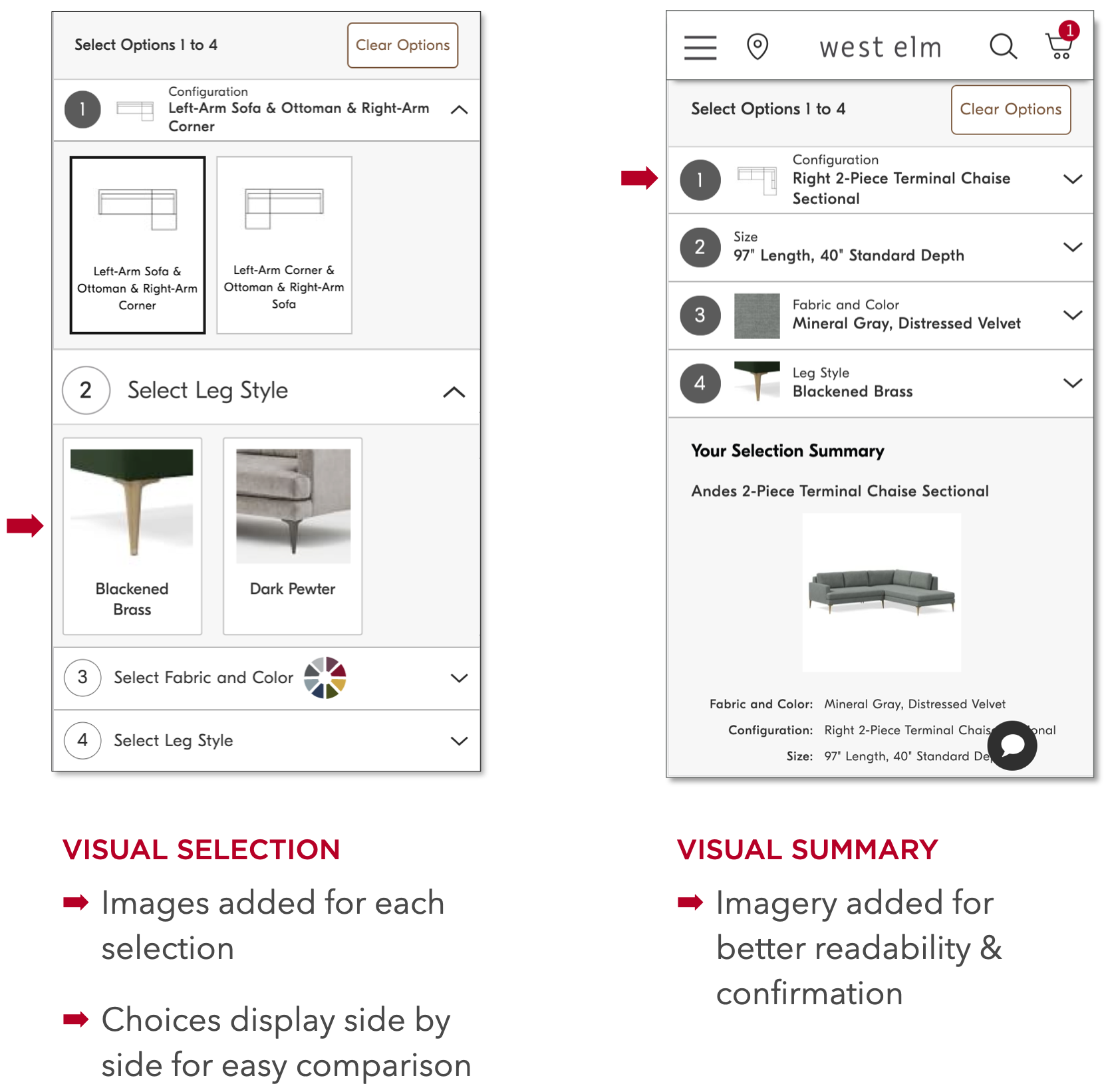
2. VISUAL HIERARCHY
PAIN POINT
Text-heavy dropdown menus, with little variation in typography, made it difficult for users to understand key differences between options.

accordions collapsed

accordions open
SOLUTION: VISUAL HIERARCHY
We redesigned selection components with clearer hierarchy, color contrast, and typographic differentiation—supporting faster scanning and comprehension.
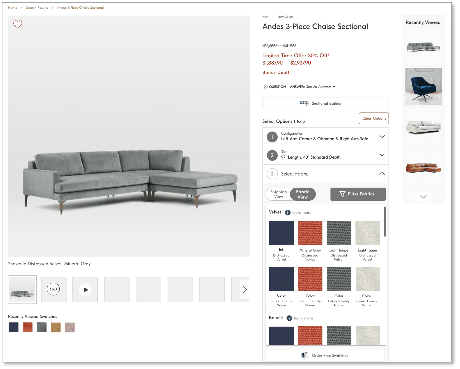
3. SYSTEMIZED FABRIC DISCOVERY AND GUIDANCE
PAIN POINT
With over 200 fabric options, the existing swatch grid was long, monolithic, and hard to navigate. Grouping by shipping speed alone wasn’t enough to help customers understand the varieties in color, texture, and performance.
We introduced multiple aids to explore fabrics:
Grouping by fabric type or shipping speed
Visual filter controls to narrow choices by key attributes
A fabric detail pop-down with close-up imagery and essential details

SOLUTION 1: GROUPING BY FABRIC
New designs offer customers the option to group swatches by type of fabric, or by shipping speed.

SOLUTION 2: FABRIC DETAIL POP-DOWN
New designs add a fabric detail pop-down window with key details and a close-up fabric image.

fabric DETAIL POP-DOWN, desktop

fabric DETAIL POP-DOWN, mobile
SOLUTION 3: VISUAL FILTERS
Visual UI affordances give customers the ability to narrow their fabric selection set by key attributes.
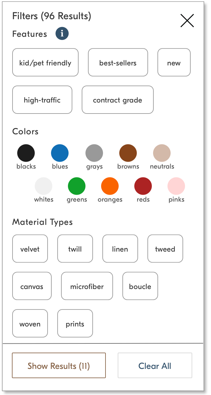
filter modal with visual filters

filter indicators let customers easily clear each filter
IMPACT
Our redesigned experience began launching incrementally in May 2020, with features rolling out over several months. Detail performance after three months of enhancements showed:
6% lift in conversion rate
Double-digit engagement increase
1.2% overall revenue lift
With this overwhelmingly positive outcome, we expanded the new designs across five additional Williams-Sonoma Inc. brands, including Pottery Barn, Pottery Barn Kids, Rejuvenation, Marks & Graham, and Williams-Sonoma.
REFLECTION
This work reinforced the value of simplifying complex, revenue-critical experiences by grounding design decisions in clarity and usability for customers, business impact, and system scalability. These principles continue to inform how I approach more complex, AI-driven systems today—where behavior is less deterministic, decisions compound quickly, and system-wide coherence becomes even more critical.

new designs SHOWING DEFAULT VIEW, DESKTOP

NEW DESIGNS SHOWING SWATCHES BY FABRIC TYPE, DESKTOP
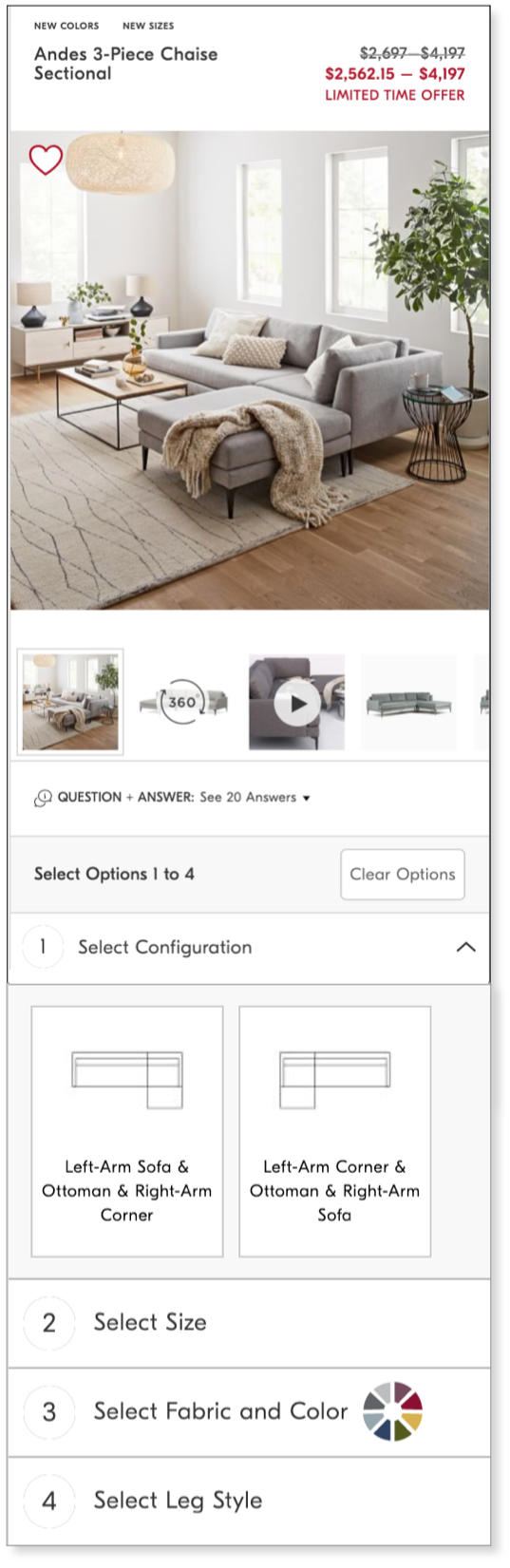
new design SHOWING DEFAULT VIEW, mobile